第一次做这种知识介绍,全篇主要是借鉴,借鉴其它文章,借鉴之后,感觉有点思路了,以后会更好吧。
TextField定义
@Composable
fun TextField(
    value: TextFieldValue,
    onValueChange: (TextFieldValue) -> Unit,
    modifier: Modifier = Modifier,
    enabled: Boolean = true,
    readOnly: Boolean = false,
    textStyle: TextStyle = LocalTextStyle.current,
    label: (@Composable () -> Unit)? = null,
    placeholder: (@Composable () -> Unit)? = null,
    leadingIcon: (@Composable () -> Unit)? = null,
    trailingIcon: (@Composable () -> Unit)? = null,
    prefix: (@Composable () -> Unit)? = null,
    suffix: (@Composable () -> Unit)? = null,
    supportingText: (@Composable () -> Unit)? = null,
    isError: Boolean = false,
    visualTransformation: VisualTransformation = VisualTransformation.None,
    keyboardOptions: KeyboardOptions = KeyboardOptions.Default,
    keyboardActions: KeyboardActions = KeyboardActions.Default,
    singleLine: Boolean = false,
    maxLines: Int = if (singleLine) 1 else Int.MAX_VALUE,
    minLines: Int = 1,
    interactionSource: MutableInteractionSource = remember { MutableInteractionSource() },
    shape: Shape = TextFieldDefaults.shape,
    colors: TextFieldColors = TextFieldDefaults.colors()
): Unit
参数含义:
- value: 显示的文本
- onValueChange: 更新后的回调
- modifier:修饰器
- enabled:是否可用,如果为false,将不可选中,不可输入,呈现出禁用状态
- readOnly:是否只读,如果是true,则不可编辑,但是可以选中,可以触发复制
- textStyle: 文字样式,前文中Text的诸多参数亦用于构建TextStyle
- label: 显示在文本字段内的可选标签,未获得焦点时呈现
- placeholder: 获得焦点时的默认呈现 类似Tint的效果
- leadingIcon: 输入框前部的图标;
- trailingIcon: 输入框后部的图标;
- isError: 输入内容是否错误,如果为true,则label,Icon等会相应的展示错误的显示状态;
- visualTransformation: 内容显示转变,例如输入密码时可以变成特定效果
- keyboardOptions: 软件键盘选项
- keyboardActions: 设置软键盘右下角按钮的点击事件,与keyboardOption中的imeAction配合使用
- singleLine: 是否单行输入
- maxLines:最大行数,需要≥1。如果将singleLine设置为true,则将忽略此参数,
- interactionSource: 表示一个由组件发出的交互流
- shape: 输入框的形状
- colors: 各种状态下的颜色 类似Android的ColorStateList,下面有TextFieldDefaults.textFieldColors简单介绍
fun textFieldColors(
textColor: Color // 文本颜色
disabledTextColor: Color // 禁用状态时候文本颜色
backgroundColor: Color // 背景色
cursorColor: Color // 光标颜色
errorCursorColor: Color // isError = true时候光标颜色
---------这面这组是TextField底部下划线的颜色,当都设置为透明时候我们就可以实现去掉下划线的效果了,对于自定义TextField样式很有效果哦----
focusedIndicatorColor: Color
unfocusedIndicatorColor: Color
disabledIndicatorColor: Color
errorIndicatorColor: Color
---------End
---------下面这些根据字面意思就知道了,不备注了
leadingIconColor: Color
disabledLeadingIconColor: Color
errorLeadingIconColor: Color
trailingIconColor: Color
disabledTrailingIconColor: Color
errorTrailingIconColor: Color
focusedLabelColor: Color
unfocusedLabelColor: Color
disabledLabelColor: Color
errorLabelColor: Color
placeholderColor: Color
disabledPlaceholderColor: Color
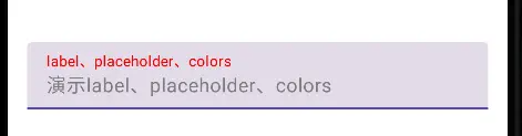
)label、placeholder、colors的属性使用
@Composable
fun LabelTextField() {
    val editText = remember {
        mutableStateOf("")
    }
    TextField(
        value = editText.value,
        onValueChange = { editText.value = it },
        label = @Composable { Text(text = "label、placeholder、colors") },
        placeholder = @Composable { Text(text = "演示label、placeholder、colors") },
        singleLine = true,
        modifier = Modifier
            .fillMaxWidth(1f)
            .wrapContentHeight(),
        colors = TextFieldDefaults.textFieldColors(
            textColor = Color.Black, //文本的颜色
            focusedLabelColor = Color.Red,
            placeholderColor = Color.Gray
        )
    )
}
去掉下划线
//关键代码,其他代码就不展示了
colors = TextFieldDefaults.textFieldColors(
focusedIndicatorColor = Color.Transparent,
unfocusedIndicatorColor = Color.Transparent,
disabledIndicatorColor = Color.Transparent,
errorIndicatorColor = Color.Transparent
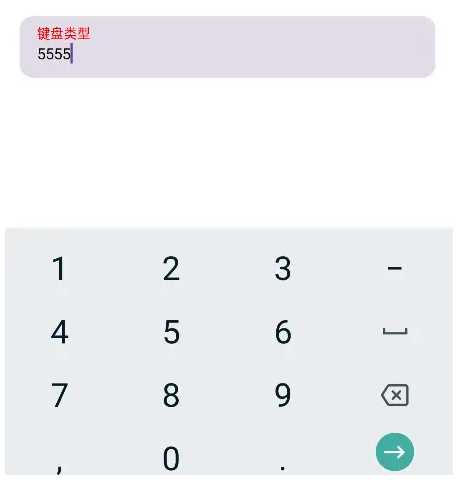
)设置键盘类型,定义软键盘右下角按钮显示类型以及点击事件
//关键代码,其他代码就不展示了
   keyboardOptions = KeyboardOptions(
            keyboardType = KeyboardType.Number,
            imeAction = ImeAction.Go
        ),
        keyboardActions = KeyboardActions(
            onGo = {
                Toast.makeText(
                    context,
                    "onSend",
                    Toast.LENGTH_SHORT
                ).show()
            })
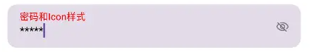
密码输入框
val pwdOff = remember {//保存密码可见性状态变化
        mutableStateOf(false)
    }
    TextField(
        ... ...
        trailingIcon = {
            IconToggleButton(
                checked = pwdOff.value,
                onCheckedChange = {
                    pwdOff.value = it
                },
            ) {
                Icon(
                    imageVector = if (pwdOff.value) {
                        ImageVector.vectorResource(id = R.drawable.ic_eye_n)
                    } else {
                        ImageVector.vectorResource(id = R.drawable.ic_eye_p)
                    },
                    contentDescription = ""
                )
            }
        },
        visualTransformation = (
                if (pwdOff.value) {
                    VisualTransformation.None//普通文本样式
                } else {
                    PasswordVisualTransformation('*')//密码样式,星号显示文字
                })
    )